Table of Contents
This post includes content from the Crash Course Statistics YouTube series. While these videos don’t necessarily fulfil the requirements of the syllabus, they explain key concepts of statistics in a different manner, just in case my explanation doesn’t work. Stats can be hard, so a bit more effort went into this post to try and make things clearer, but (as always), it should be supplemented with your textbook and teacher’s resources.
Bivariate Data Analysis
What is data?
- Data is a term that will come up frequently throughout the Statistical Analysis modules
Data is a collection of facts or information about something. Examples of data include shape, color, size, and quantity.
- Data can be split into 2 types: quantitative and qualitative
- Quantitative data is numerical data, such as weight or height. You can do math on quantitative data. Quantitative data is usually a measurement, a ranking, or some sort of sliding scale.
- Qualitative data is non-numerical data, such as color or shape. You cannot do math on qualitative data. Personal preferences and survey responses tend to be qualitative data.
- Both qualitative and quantitative data can be graphed:
- Quantitative data can be presented as nearly any kind of graph, so it’s up to you to decide which type to present it in. Usually, a bar/column graph, a table, or a line graph, is best for quantitative data.
- Qualitative data can only be presented in a limited number of ways, such as a bar/column graph, a table, or a Pareto chart.
What is bivariate data?
- Bivariate data is data which has two variables, for example height and weight
- Bivariate data is usually used to compare two sets of data, or attempt to find a relationship between the two variables
- For quantitative data, a scatter plot is usually used to determine the relationship between the numerical values
- The two variables are sorted into ordered pairs, and then plotted, point by point, onto a graph
- The line or curve of best fit is also added in to determine the relationship between the sets of values
- Sometimes, there is no correlation between the sets of data:
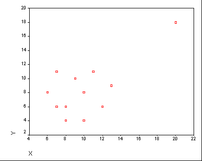
- In the above dataset, the values seem to be randomly scattered. It can be said that the data has little to no correlation.
- Correlation can be determined using the gradient of the line of best fit. If the gradient is close to 0, then there is most likely very little correlation between the sets of values.
Forms of association
- For bivariate data which does have some sort of trend, there are two “forms of association,” or general shapes for the curve of best fit:
- Linear forms of association are straight lines of best fit. If a scatterplot has a linear curve of best fit, the data is considered to be “directly proportional”
- Non-linear forms of association are non-straight curves of best fit. If the points on a scatterplot have a visible trend (such as a U shape), the data is may be “proportional to the square,” “inversely proportional,” or “exponentially proportional” (These terms will be explained later on).
- Linear forms of association will be the most common for this topic.
- For linear forms of association, there are three directions in which the data can trend:
- A positive linear form is where the gradient of the line of best fit is greater than 0 (i.e. positive)
- A negative linear form is where the gradient of the line of best fit is less than 0 (i.e. negative)
- A neutral linear form is where the gradient of the line of best fit is 0 (i.e. not positive or negative)
- In addition to form and direction, bivariate data has another property: strength
- The strength of bivariate data has less to do with the line of best fit, and more to do with the amount of scatter between values on the scatter plot
- The less scatter there is in the plot (i.e. the closer the data is to the line of best fit), the stronger the association
Independent and Dependent Variables
- Usually, bivariate data comes in the form of a dependent and independent variable pair, which you may recognise from science
- The independent variable is the input, and is graphed along the x-axis (horizontal axis)
- The independent variable is NOT AFFECTED by the dependent variable
- The dependent variable is the output, and is graphed along the y-axis (vertical axis)
- The effect of the independent variable on the dependent variable is what the strength of association measures
- In other words, the strength of association is a measure of how much the dependent variable is affected by the independent variable
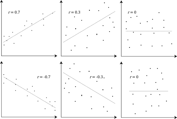
Correlation Coefficients
- The strength of correlation can be calculated numerically, using Pearson’s correlation coefficient, also referred to as $r$
- The correlation coefficient measures how close the points on the scatterplot are to forming a straight line
- The close the plot is to linear, the stronger the association
- $r$ can take any value between -1 and 1, but the closer it is to 0, the less association there is $(r=0 \text{ means no correlation}).$
- The diagram below demonstrates some scatterplots with different correlation coefficients
Interpolation and Extrapolation
Interpolation is the use of the linear regression line to predict values within the range of the dataset.
If the data has a strong linear association then we can be confident our predictions are accurate.
However, if the data has a weak linear association, we are less confident with our predictions.
Extrapolation is the use of the linear regression line to predict values outside the range of the dataset.
Predicted values are either smaller or larger than the dataset.
The accuracy of predictions using extrapolation depends on the strength of the linear association similar to interpolation.

The Normal Distribution
- The graph of a normal distribution is called a ‘bell curve’.

The frequency curve is bell-shaped and symmetrical about the mean.
A normal distribution is symmetrical about the mean.
The mean, median and mode (the score that occurs the most) are equal.
The majority of the data is located closer to the centre, with less data at the tails.
Mean (μ) and standard deviation (σ) of the dataset is used to define the normal distribution.
Keeping the same mean but different standard deviation causes a graph to move up or down in height.
Keeping the same standard deviation but different mean causes a graph to move left or right.
If it has a large standard deviation, the scores are widely spread from the mean.
If it has a small standard deviation, the scores are close to the mean and the graph is tall and narrow.
The X-axis is asymptote in a normal distribution.
Empirical Rule (68-95-99.7 Rule)
- In a normal distribution:
- 68% of data lie within 1 standard deviation of the mean
- 95% of data lie within 2 standard deviations of the mean
- 99.7% of data lie within 3 standard deviations of the mean
- 50% of data lie above the mean, and 50% of data lie below the mean.

Z-Scores
- A z-score (also known as standardised scores) is a measure of how far a particular value is from the mean of a dataset.
$$z=\frac{x-\bar{x}}{s}$$
$x$ is the value, $\bar{x}$ is the mean of the dataset, and $s$ is the standard deviation.
To convert a z-score into an actual value, you can rearrange the formula to:
$$x=\bar{x}+(z\times s)$$
- Z-scores enable data from 2 different datasets to be measured.
- Make sure you consider whether a higher or lower score is better. For example, a higher z-score in a test is better, but a higher z-score in caffeine consumption is probably worse.
- z-scores can be negative or positive: a negative z-score means that the value is BELOW the mean, while positive z-scores mean that the value is ABOVE the mean.
- The magnitude (the number, ignoring the sign) of a z-score is how far that score is from the mean. A bigger number means the value is further from the mean (e.g. z=2 is further from the mean than z=-1.5)
Application of the Normal Distribution
- We can convert the empirical rule from earlier to be used with z-scores instead:
- 68% of z-scores fall between -1 and 1
- 95% of z-scores fall between -2 and 2
- 99.7% of scores fall between -3 and 3
- Essentially, a z-score is just how many standard deviations a particular value is from the mean of the dataset.
- While z-scores above 3 or below -3 are possible, only 0.3% of data will fall past these bounds. As a result, these are usually outliers, and should be discounted.